Greeting
Allow me to open with our heartfelt gratitude and appreciation to the countless supporters of the Tokyo Fuji Art Museum for the understanding and patronage you have so generously rendered over the years.
Our museum celebrated its 40th anniversary of its founding on November 13, 2023. The occasion not only provided us with an important opportunity with which to review the manifold activities we have engaged in that time, it also led us to undertake a thorough reevaluation of our institution with an eye toward to scaling greater heights in the years to come. This endeavor was led by Kiyonobu Yahata, an expert on brand strategy and management, who was tasked with the museum’s rebranding initiative.
The first step that we took was to further clarify and refocus our museum’s mission statement, a collective effort by members of our inhouse Branding Committee with the invaluable counsel of renowned writer and editor Shinpei Higashi. After considerable discussion on the founding vision and mandate of our institution, as well as on the actions we have taken since, Mr. Higashi and our committee partnered in a solution we believe will serve as an enduring guidepost from which our institution may set forth anew.
The next step in our rebranding initiative was to establish a brand identity through a new design language. To this end, we organized a competition in which numerous creatives vied. For our new logomark, we decided on the proposal submitted by Creative Unit Lim and contracted type designer KOKIN (Tetsuyuki Kokin) to create an original new logotype to accompany it. While the logomark and logotype are distinct in artistic character, we believe that when paired they provide a high degree of creative synergy.
As such, we decided early in the design process to release our logotype, the FAM Sans Serif (Regular), into the public domain in the hope that it will be widely accepted by people throughout the world.
Just as we always have, we intend to strive to the utmost of our abilities in the hope that people will take to the refreshed identity and beautification of the Tokyo Fuji Art Museum. Your continued patronage will be very much appreciated.
Tokyo Fuji Art Museum
Our Founding VisionTo Serve as “A Window Onto the World”
On May 3, 1983, on a visit to the Tokyo Fuji Art Museum, founder Daisaku Ikeda urged the museum to serve as “a window onto the world.”
MottoFostering Global Citizens is Our Mandate
On May 3, 1983, on a visit to the Tokyo Fuji Art Museum, founder Daisaku Ikeda urged the museum to serve as “a window onto the world.”
When the museum opened its doors later that year in November, Mr. Ikeda shared his sentiments for establishing the institution: that it make great art available to as many people as possible and that culture and the arts—with their capacity to stir individuals and bring them together—can transcend the differences dividing people and nation-states. Our museum has stayed true to these sentiments, actively organizing numerous exhibitions ever since to promote cultural exchange with various countries across the world.
Having pursued dialogue with heads of state and leading thinkers around the world for more than a half-century, Mr. Ikeda has long cherished a vision in which a truly global civilization will flower. The key influence in the emergence of such a civilization, as he saw it, will be ordinary people from every walk of life united and empowered by their consciousness of being global citizens.
Global citizens, here, are defined by their embrace and celebration of humanity’s cultural and historical diversity. Such individuals appreciate that their own culture has evolved and developed through interaction with other cultures. And, while rooted in a sense of love and responsibility for their respective homelands and communities, they are cognizant of their identity and responsibility as members of the larger global family.
The Tokyo Fuji Art Museum’s exhibitions both in Japan and abroad to facilitate cultural exchange and international understanding are premised on the belief that art is a window onto a world through which the beauty of our shared humanity is celebrated. In this way, we strive to contribute to the building of a culture of peace in partnership with each visitor.
The Rebranding of Our Museum
Tokyo Fuji Art Museum’s rebranding initiative was launched with the aim of remaking the institution as it strikes out toward its golden anniversary in 2033. It established the Branding Committee, which drew on input and counsel from inhouse and external contributors, to clarify and finetune the museum’s fundamental identity. As a result, we arrived at the brand concept of the museum as a communicator of peace and beauty by making art accessible to all. While the concept’s latter part on accessibility clearly refers to the museum’s core effort of expanding the availability of great art to the public, it also refers to the enabling of an individual to access the “art”—or inner beauty—that lies within.
The capacity of art to inspire and move people for peace is an equally elemental part of Tokyo Fuji Art Museum’s core identity. We therefore employed the following language to defined our brand personality: kind and gentle; pacifistic, tolerant and insightful; upholding traditional values while being innovative, original and creative. The new logo embodies these core brand attributes, while its logomark also hints at the rich natural surroundings of the Hachioji suburb in which the museum is located.
Kiyonobu Yahata,
Brand Director, OICHOC Inc.
Our Logo
Download GuidelineThe brand concept of the Tokyo Fuji Art Museum is to serve as a communicator of peace and beauty by making art accessible to all.
Ostensibly, “making art accessible to all” refers to the museum’s core effort of enhancing opportunities for the general public to experience, as much as possible, great art. From a deeper perspective, however, it exhorts us to access the “art”—or inner beauty—that lies within every individual.
We described our brand personality as being endowed with such attributes as kind and tranquil; pacifistic, tolerant and insightful; innovative, original and creative while upholding traditional values. The new logo embodies these core brand attributes.
The logomark drew inspiration from various sources, including a stylized imagery of Mt. Fuji, reflecting the museum’s concurrent commitment to appreciating traditional values while forging ahead in institutional initiatives with the spirit of innovation and imagination.
The English-language logotype was designed to be airy, friendly and elegant. Each letter is structured to present a certain robustness that also gives an impression of both certitude and universality.
Color Concept
The brand color of the new Tokyo Fuji Art Museum logo was chosen to express the brand concept of our museum as a communicator of peace and beauty by making art accessible to all.
Brand Color: Platinum
The choice of platinum is self-evident: refined and stately, platinum is endowed with a natural gravitas without being boisterous or overbearing and is readily compatible with other colors. It is not only reflective of the Tokyo Fuji Art Museum’s expansive palette in terms of artistic and eclectic genres, we believe it expresses optimism for a future of meaningful progress and the institution’s innovative essence.
Sub-Color / Sample Palette
Blue / Pink / Green
As blue is commonly symbolic for intelligence, the color was selected as being synonymous with the knowledge and education one can enjoy by visiting the Tokyo Fuji Art Museum. One of the symbols for the color pink is affinity, thus representing the brand concept of “making art accessible to all.” Green, meanwhile, can express “living in harmony,” or peace, and is indicative of the museum’s vision of building peace through the sharing of great art.
Logo Design
In renewing the Tokyo Fuji Art Museum’s logo and brand visual identity, there were two salient facts that we needed to express: first, that it is an art institution of truly global caliber possessing a collection of quality works from Japan as well as from elsewhere in the East and West. And second, that the museum is open to people of every ilk and may be widely appreciated by all.
The logomark we created consists of an unique alphabet and stylistic elements that melds the classic with the modern, resulting in a design that is readily accessible while being refined at the same time. And its expression changes depending on how the logomark is combined with the logotype, providing the impression that it is as innovative and playful as it is endearing and even reassuring.
When its range of colors is included, the design conveys a sense of continuity with the institutional traditions the museum has built up over the decades. By adding a new perspective, moreover, the design further enhances the museum’s rich message and imagination. Taken together, we feel it thoughtfully depicts the brand concept of the museum serving as “a communicator of peace and beauty by making art accessible to all.”
Creative Unit Lim
English-Language Logotype Design
Having encountered the Tokyo Fuji Art Museum’s founding vision and mandate, I set out—just as I had with the Japanese logotype—to create a design underpinned by such values as universality and tenderness, which I associate with the capacity of art to enrich our very humanity. A design in which each letter of the alphabet itself speaks to the viewer with grace and dignity, it would be the face that welcomes visitors to the museum.
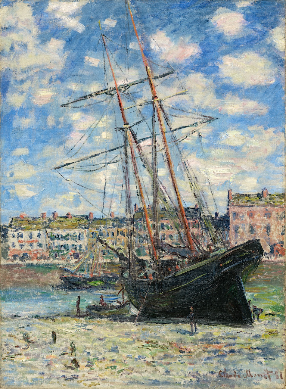
In creating the logotype, I drew inspiration from the premier examples of Western paintings collected by the Tokyo Fuji Art Museum, where the letters may be likened, in an understated manner, to lithic inscriptions. They retain, at first glance, a sharp and distinct shape, yet when observed more carefully, the letters T, K, A and M are subtly accented with brushstrokes to give the logotype a somewhat unique identity, evoking a sense of gentle dexterity.
KOKIN, Artist and typographer
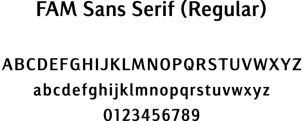
Our Original Font( Single-byte alphanumeric character)
Use of Images
Education Non-Commercial Commercial
Original Font
Given the Tokyo Fuji Art Museum’s founding vision and mandate, I designed the font which has at its roots such values as universality and tenderness that I associate with great art, with its capacity of enriching our inner humanity. As with the logotype, the font was produced to evoke a tangible measure of subtlety and character from a random aggregation of letters.
Subtle brushstroke accents on the English-language logotype were applied to a select number of letters so that, when combined in various ways, they would collectively reveal an understated personality. The logotype is also evocative of inscribed stone that were culled from the imagery I culled from the Western paintings in the museum’s prized collection.
The font comes in three different weights, making it readily applicable to everything from standard text to signage and flexible enough to meet multiple needs in multiple languages. It is entirely original and created in the hope of satisfying users throughout the world across an array of applications.
KOKIN, Artist and typographer
TFAM Official Navigator
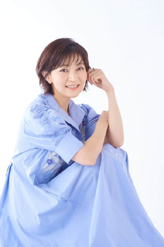
Yoko Honna
voice-over artist, actress and vocalist
The Official Navigator of the Tokyo Fuji Art Museum is voice-over artist, actress and vocalist Yoko Honna. She narrates the Japanese-language presentation and audio guidance segments of the works of Western paintings on display at our New Wing Permanent Gallery.
Visitors familiar with the Japanese language can access, via QR code, Ms. Honna’s presentation of the works on display at our New Wing Permanent Gallery.
While the number of presentations are currently limited to selected works, the selection will increase over time. Our museum asks visitors to use their smartphones to read the QR code and listen with your earphones so as not to disturb the viewing of other visitors.
On Audio Guidance
The audio presentations accessible through our TFAM website are also narrated by Ms. Honna.
She narrates the Japanese-language presentation and audio guidance segments of the works of Western paintings.
PROFILE
Yoko Honna (voice-over artist, actress and vocalist)
Yoko Honna began her career as an actress playing Little Cosette in the theatrical production of Les Misérables. In 1991, she debuted as a voice-over artist in the role as Taeko Okajima in the full-length Studio Ghibli animated film Only Yesterday. Four years later, she played Shizuku Tsukishima, the lead role in another Ghibli animation, Whisper of the Heart; she also sang the movie’s title song, “Concrete Road.” Her pure and wholesome vocals in that song led it to rank 22nd on the music industry hits service Oricon Singles Chart. She then made the Top-10 new vocalist list for 1995. Ms. Honna has gone on nationwide concert tours since 2008, appearing in her first overseas tour in Beijing and Shanghai, China, in 2019.
Ms. Honna has also appeared in the anime television series We Are Pretty Cure in the role of Nagisa Misumi/Cure Black; the Mobile Suit Gundam 00 series as Sumeragi Lee Noriega and as Clair Voyance in the feature-length movie version of My Hero Academia. In addition, she has done Japanese voice-overs for such foreign TV and films as The Handmaid’s Tale in the role of June played by Elisabeth Moss; Amazing Spiderman in the role of Gwen played by Emma Stone; the limited TV series 24: Live Another Day in the role of Kate; and the science-fiction movie Battleship in the role as Samantha. Ms. Honna has also narrated the Google YouTube Works Awards as well as various TV commercials and programs, and continues to perform as a theatrical actress in various plays.